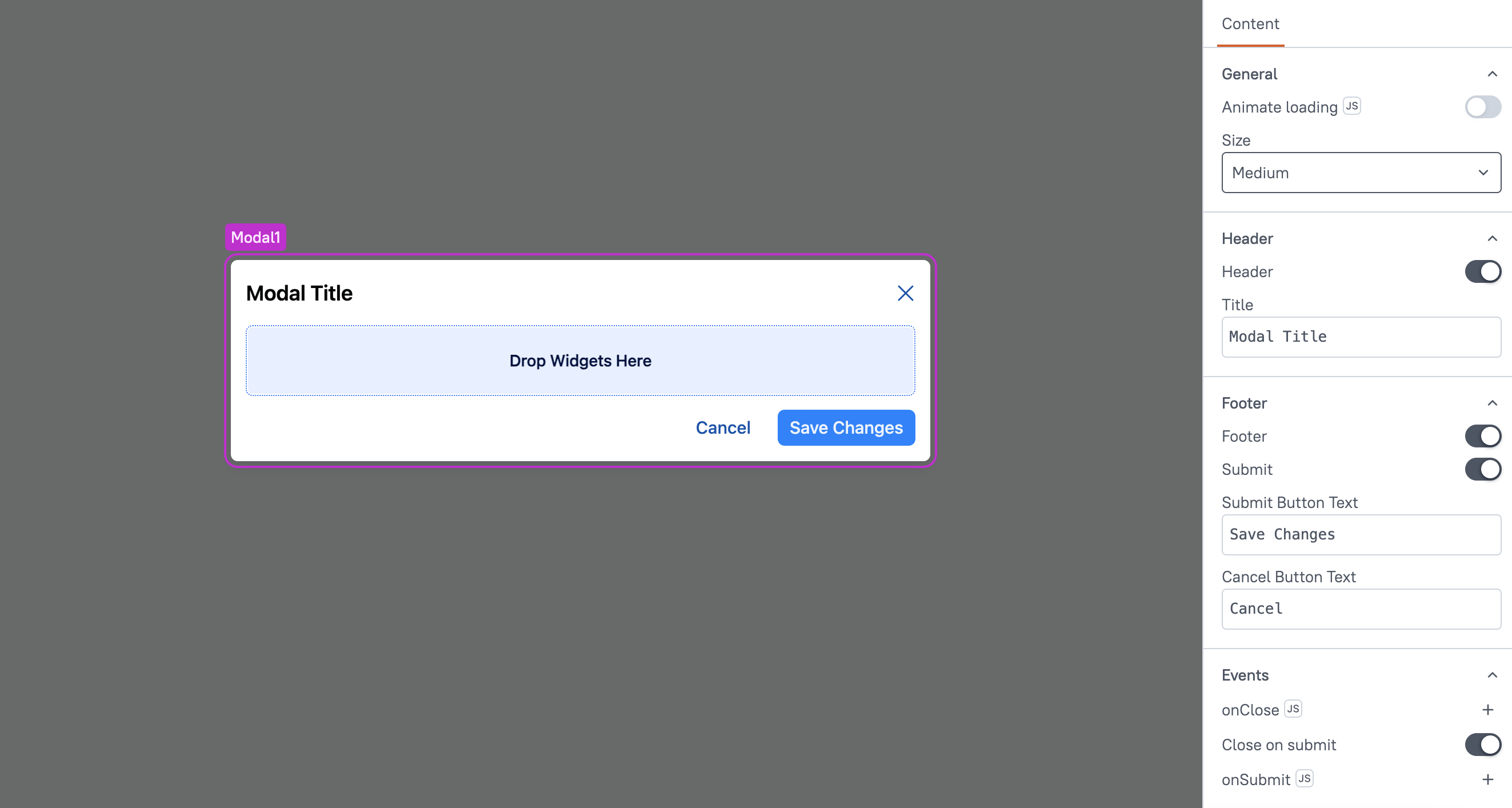
Modal (AI Assistant)
This page provides information on using the Modal widget (available in AI Assistant Apps), which allows you to create dialog boxes in your app to display various types of content, such as alerts, confirmation pop-ups, forms, and more,

Content properties
These properties are customizable options present in the property pane of the widget, allowing users to modify the widget according to their preferences.
General
General properties are essential configurations that provide overall control over the widget's behavior and appearance.
Animate Loading boolean
This property controls whether the widget is displayed with a loading animation. When enabled, the widget shows a skeletal animation during the loading process. Additionally, you can control it through JavaScript by clicking on the JS next to the property.
Size string
The Size property determines the overall dimensions of the Modal. You can choose from the following options:
- Small
- Medium
- Large
Header
These properties allow you to control the header section of the Modal, which is used to display a title or additional context to the content inside the Modal.
Header boolean
When enabled, it displays the Title property, allowing you to add a title to the Modal. When disabled, the header, including the title, is hidden.
Title string
Sets the title for the Modal. This property is only available when the Header property is enabled.
Footer
These properties allow you to customize the footer section of the Modal, which typically contains action buttons.
Footer boolean
When enabled, it displays the footer section, which contains two buttons: Submit and Cancel for performing user actions. When disabled, the footer, along with the buttons, is hidden.
Submit
When enabled, this property displays a Submit button in the Modal. The Submit button allows users to save their changes. It triggers an action defined by the onSubmit property, which performs the necessary operation, such as saving data or processing input.
Submit Button Text string
This property allows you to customize the text on the Submit button. By default, it shows "Submit," but you can change it to any label, such as "Save" or "Confirm."
Cancel Button Text string
This property allows you to customize the text on the Cancel button. By default, it shows "Cancel," but you can change it to any label, like "Dismiss" or "Go Back."
You cannot set a custom event for the Cancel button. When clicked, it automatically closes the Modal without saving any changes.
Events
Events are properties that allow you to define actions or responses based on user interactions or widget state changes.
onClose
Specifies the action (such as framework functions, queries, or JS functions) to be executed when the Modal is closed. This event is triggered whether the Modal is closed manually by the user or automatically through any action or condition.
Close On Submit
When enabled, this property automatically closes the Modal when the Submit button is clicked. It ensures that the Modal is dismissed after submitting the form or saving changes, providing a seamless user experience.
onSubmit
This event is only available when the Submit button is enabled. It defines the action to be performed when the Submit button is clicked, such as saving data or processing form inputs. You can specify framework functions, queries, or JS functions to run when the Submit button is pressed.